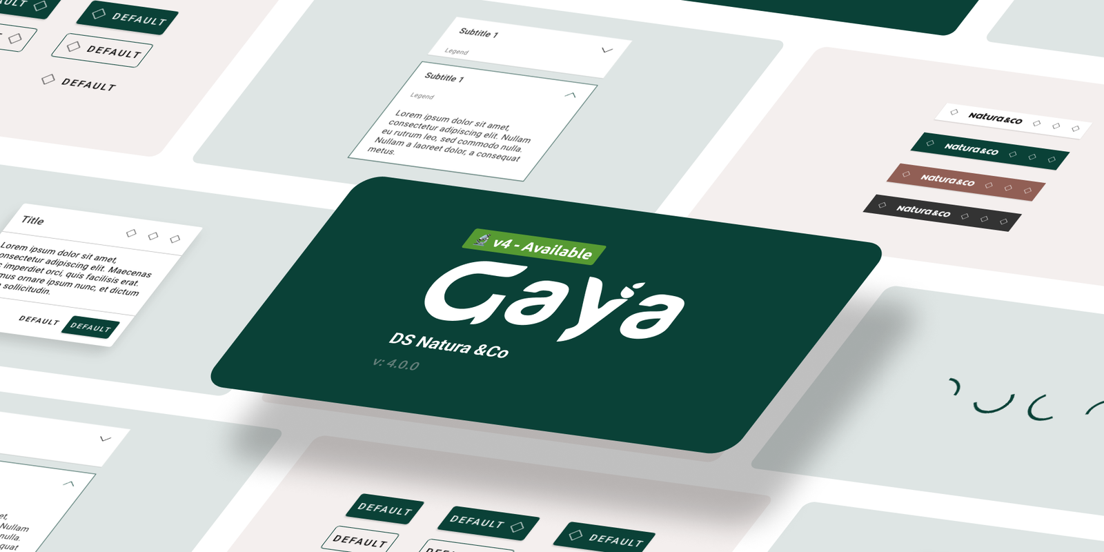
Project Overview
About
Natura &Co operates in more than 100 countries, with over 3,700 stores, 35,000 employees and 7.7* million Representatives and Consultants.
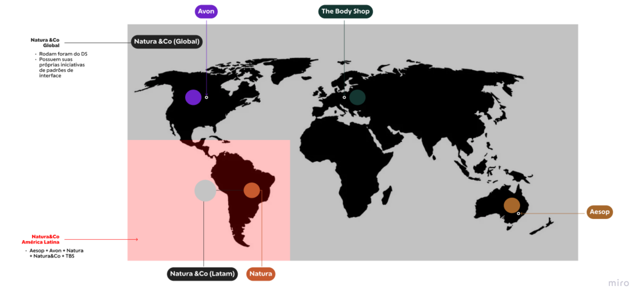
The Natura&Co group is formed by different brands, applications and technological platforms. In this plural and scaled universe, several problems arise, such as:
Difficulty maintaining visual and user experience consistency
Difficulty establishing a common understanding vocabulary
Difficulty standardizing code writing
Many people doing the same job over and over
Many people doing the same job over and over
Challenges
Build an ecosystem so that people who work in the Natura&Co group's digital products will be able to create consistent and adherent solutions to the brands with reduced time to market, benefiting from the best standards and practices, for every technical stack in their products.
My Role
My role in this project was to act as Product Designer, improving the technical specification, documentation, branding and motion libraries, as well as technical support for designers and developers, performing QA of components ensuring the technical feasibility of components in all technologies applied in their products.
Tools
Jira and Notion (Squad Management & Status), Miro (Data map & architecture), Figma and Adobe XD (UI & Prototype), Zeroheight and Storybook (technical documentation).
The Process
Research and Analysis
The first step was to conduct thorough research to understand the existing design system, its strengths, weaknesses, and pain points. I collaborated with designers, developers, and stakeholders to gather insights and feedback, which helped in defining the status of the Design System and its components.
Defining Tasks and Objectives
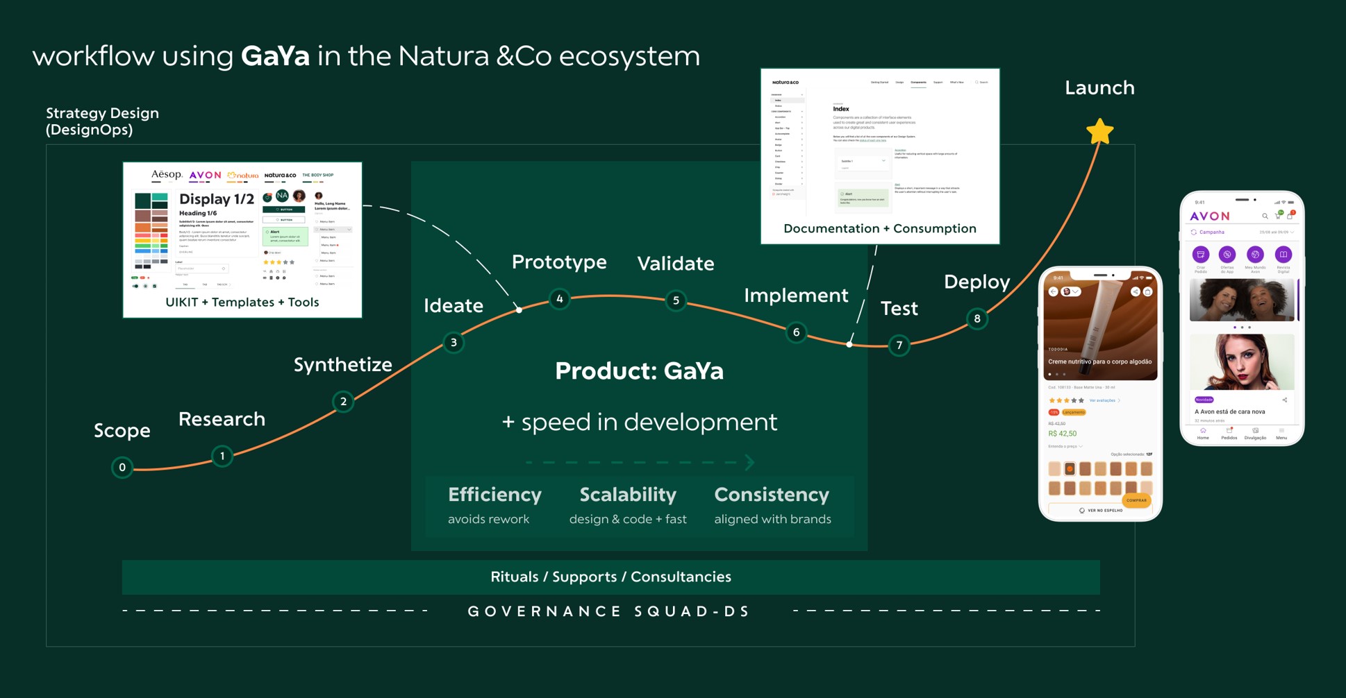
With a clear understanding of the design system's current state, it's easier to specific goals and objectives for the improvement process in each sprint. These goals were focused on enhancing collaboration, streamlining workflows, and delivering a more consistent user experience on every platform.
Design System Audit
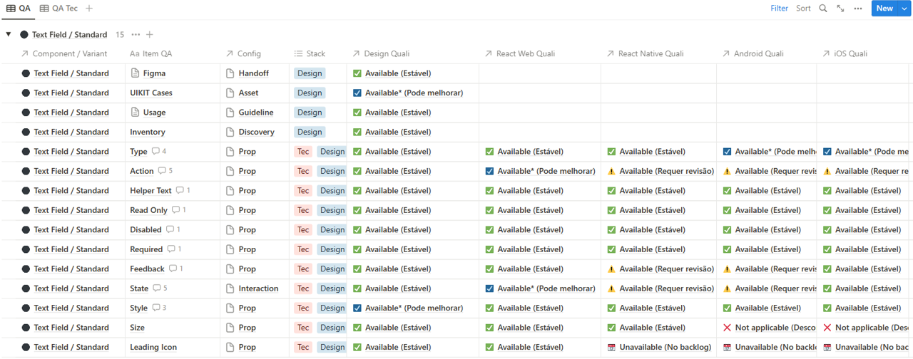
I performed an extensive audit of the existing design system to identify outdated components, inconsistencies, and areas for improvement. This audit was documented using Notion and Jira, creating visual representations of the design system's status and components relationships.
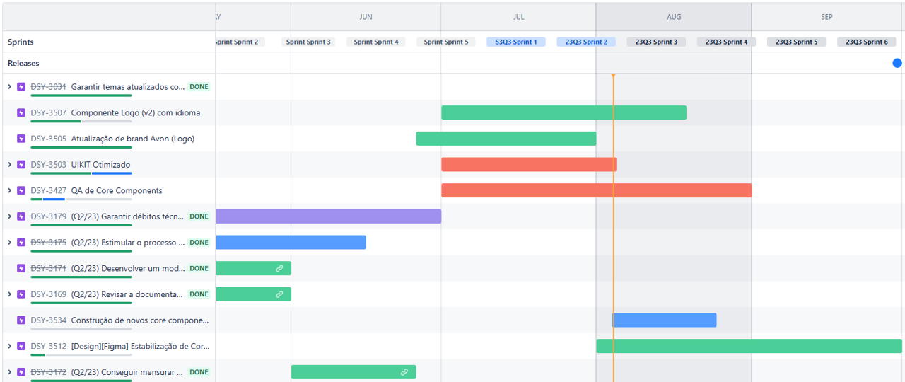
Creating a Roadmap
Based on the research, analysis and audit, a roadmap was defined outlining the project's tasks, timelines and milestones. This roadmap served as a guiding document for the team, ensuring we stayed on track throughout the improvement process. Raising in each sprint the process of analysis, development, handoff and documentation necessary to update the components.
Iterative Design and Development
Using Figma and Adobe XD, I will iteratively design and prototype updated components if needed. I collaborated closely with the developers during this process to ensure technical feasibility and efficient implementation.
Documentation and Guidelines
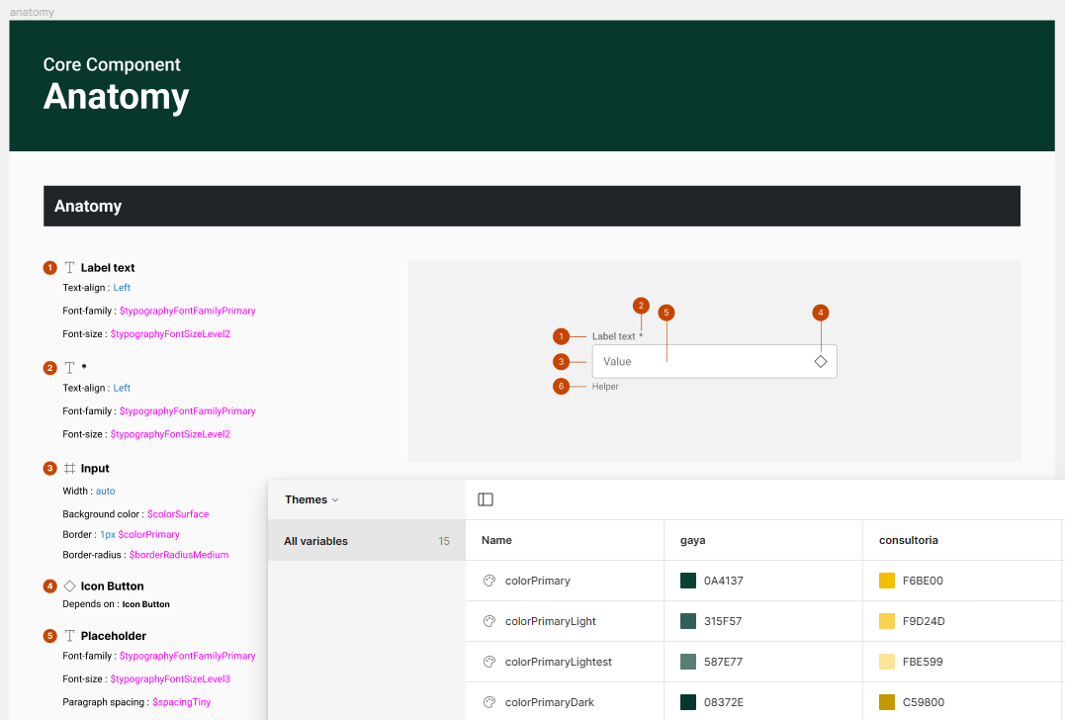
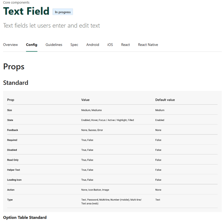
As new components were designed or updated, I simultaneously documented their technical specifications, usage guidelines, and behavior across different platforms. This documentation was organized using Zeroheight, making it easily accessible for all team members.
Testing and Quality Assurance
Every component underwent rigorous testing to ensure it met the desired standards and worked seamlessly across various technologies. Storybook was used to test the components' technical feasibility and to address any visual issues promptly.
Solutions
Streamlined Collaboration: By utilizing tools like Jira and Notion, it was established effective communication channels and improved collaboration between designers, developers, and other stakeholders. This streamlined workflow resulted in faster decision-making and issue resolution.
Enhanced Visual Consistency: The updated branding, guidelines and libraries helped maintain a cohesive visual identity across all products. This consistency improved brand recognition and provided users with a familiar and delightful experience.
Improved Technical Documentation: The comprehensive technical documentation in Zeroheight provided clear guidelines for designers and developers, reducing ambiguity and ensuring consistent implementation of components.
Efficient Technical Support: The structured technical documentation, combined with accessible support channels, empowered designers and developers to find solutions quickly, enhancing productivity and reducing development bottlenecks.
Final Product & Results
Increased Efficiency
The improved design system and its comprehensive documentation significantly reduced the time required for designers and developers to create and implement components. This led to faster product development cycles.
Consistent User Experience
With a well-defined design system in place, all Natura&Co products exhibited a consistent and harmonious user experience, irrespective of the technology used for development.
Stronger Collaboration
The improved communication channels and streamlined workflows resulted in better collaboration between design and development teams. This collaborative environment fostered creativity and innovation.
Higher Product Quality
The rigorous QA process and technical feasibility checks ensured that only high-quality and reliable components made it into the final products. This translated into fewer bugs and a more stable user experience.
Enhanced Brand Image
The consistent branding across all products strengthened Natura&Co's brand image, fostering trust and loyalty among users.
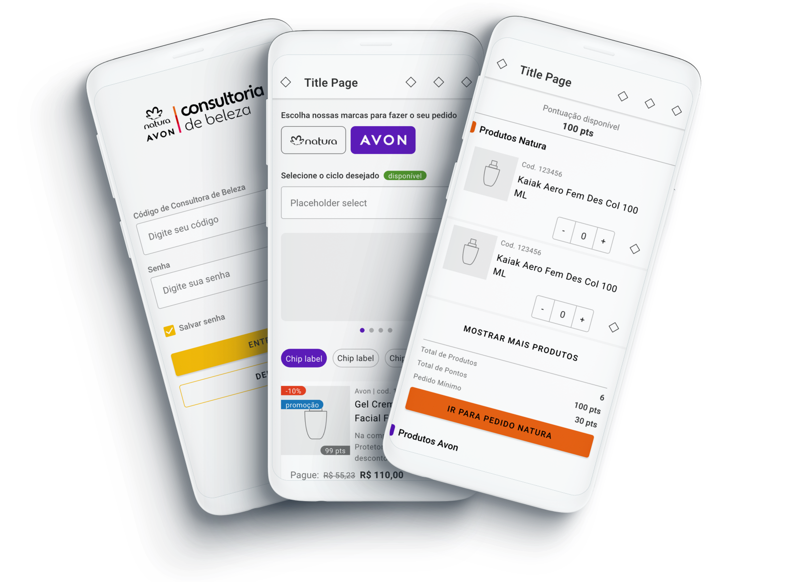
In conclusion, the improvement of the Natura&Co design system has been a transformative project that has positively impacted the organization's efficiency, collaboration, and user experience. The process of research, design, and development, coupled with comprehensive documentation and testing, has resulted in a robust and reliable design system that serves as the foundation for creating exceptional products.
34
Core components
6
Brand themes
22
Squads
+390
Design System users
+84.300
Dev hours reduction (2023)