
About
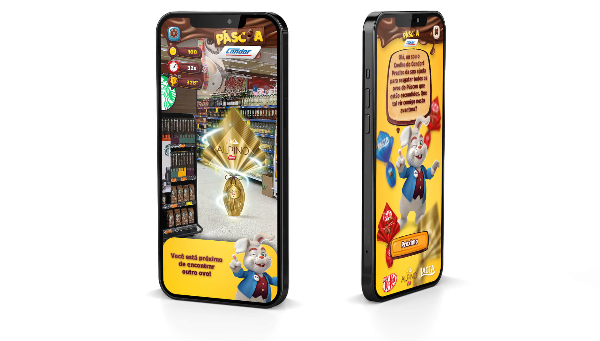
In the marketing area, various projects are developed, this game was designed to be launched during the Easter campaign, as a complement to the promotional materials and focusing on customer engagement, presenting products to customers and reinforcing the presence of brands during the campaign.
Challenge
The challenge was to create the game dynamics, such as functionality, scoring, information and tips, as well as creating the visual guide and structure of the game interface.
My Role
My role was to work together with the squad to create the game experience and mainly develop the game's UI, the structure and game’s visual guide and interactions using low and high fidelity prototypes.
Tools
Adobe Photoshop and Illustrator (Interface and Visual Design), Adobe XD (Prototype).
Discovery & Problem Definition
At the beginning, market research was carried out, gathering some information about games and applications with a geolocation technology that could be used locally in stores, creating a more active and participatory experience by the user.

Solution
So it was defined a game that uses the smartphone camera, with the objective of searching and collecting the products that would be advertised in the campaign, each product has a different score and at the end of the play, a general ranking of players is generated, the game uses technology of geolocation to distribute the products randomly in the store, the main character frequently appears with tips and information for the player, indicating the locations and presenting constant feedbacks.
Sketch and Wireframes
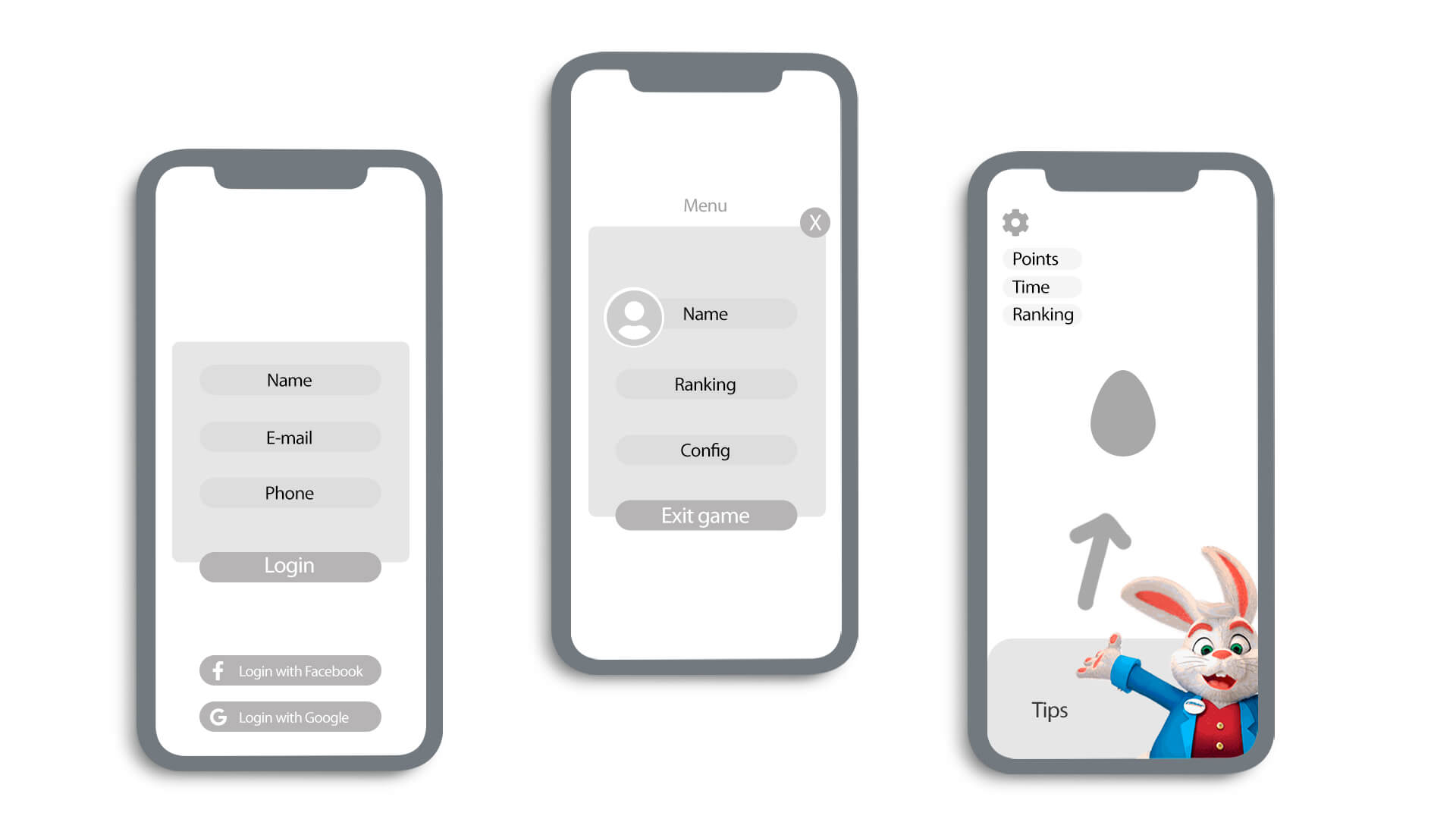
From the search for similar products, some important information about the structure of the game was raised, such as the position of buttons, menus, interaction elements and interface. The mobile usage experience, touch areas and better usability for interactive elements were also studied.
Visual guides and style
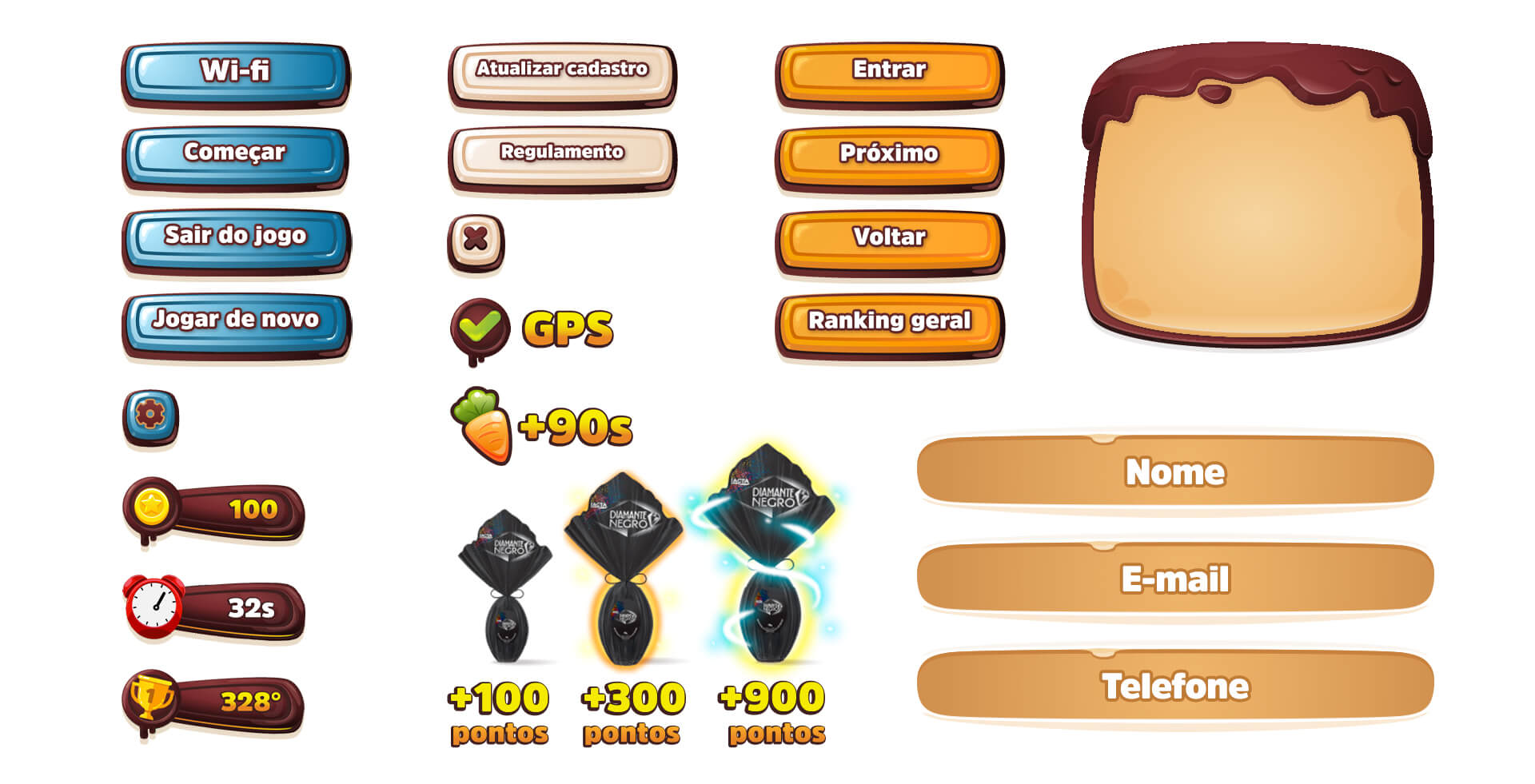
The visual elements were based on the key look of the Easter campaign, implementing an interface consistent with the campaign, with assets developed with a visual of sweets and chocolates, implemented a friendly, light interface and following the campaign's proposal. Different colors have been defined for the buttons according to their importance, such as action, system and configuration. The visual approach of the items was defined by their score, items with a higher score are bigger and have an aura and power-up style animations.
Final UI
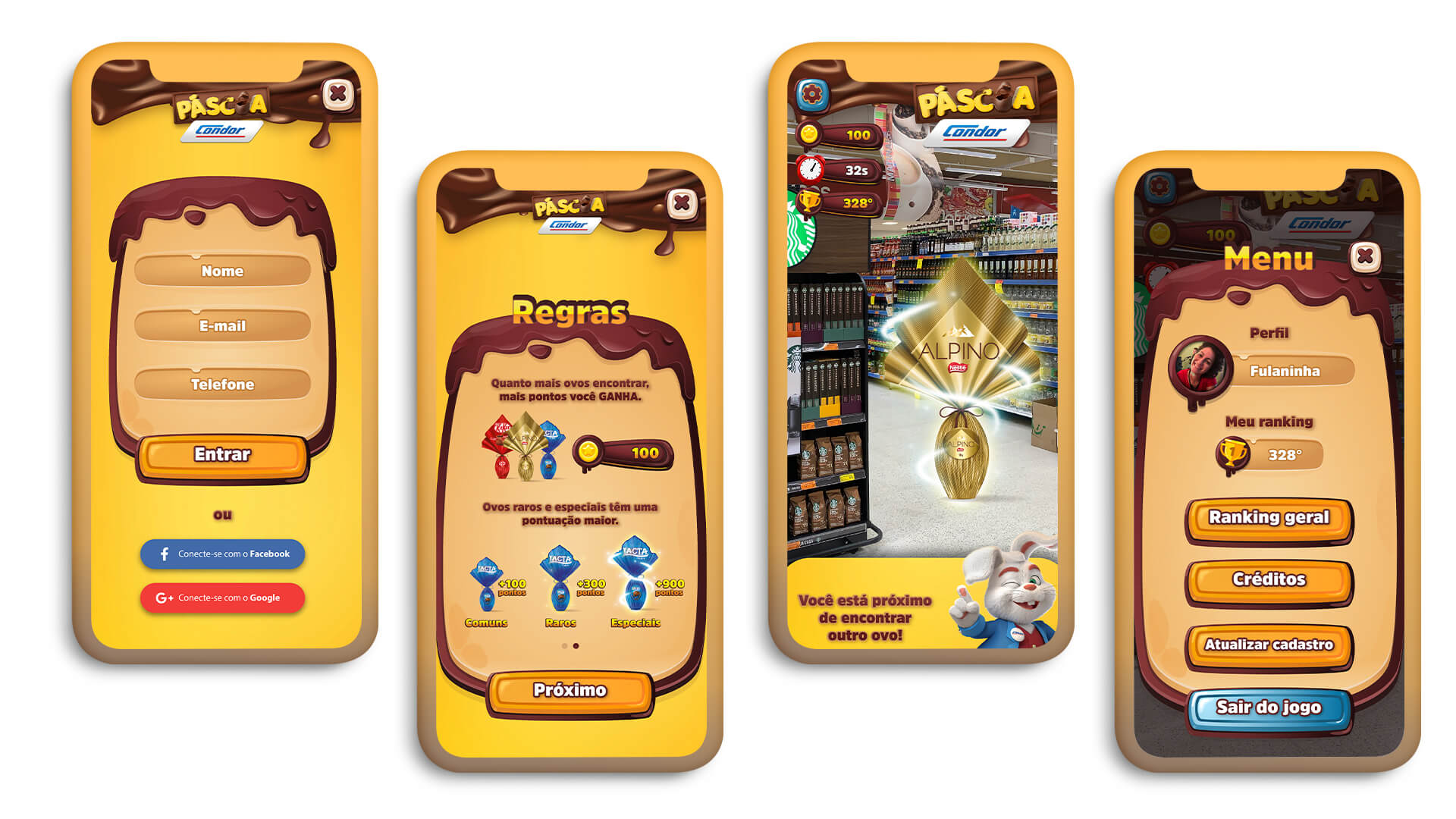
As the game is aimed at a more child-friendly target audience, the user interface must be easy and accessible for users with different levels of technical knowledge and all types of mobile devices. The layout is structured with intuitive navigation, high legibility, colorful buttons and attractive visuals. Color contrast and candy style elements are used to expand fast navigation: bright and different colors in the interface attract users' attention to interactive zones and active states of layout elements such as buttons, game score and mechanics.
Prototyping
The prototype was done with Adobe XD, showing the main screens and final layout.